
Reviewed by Masha Zhdanova
A pair of maids rendezvous in a garden to exchange love letters. An artist and a critic reconnect long after breaking up. A lifestyle youtuber hooks up with her biggest hater. A connection made over an app leads to a supernatural date. The first two issues of Datura, edited by Sunmi and Mar Julia, contain all of these stories and more, comprising a total of eight beautifully-printed short stories by eight creators that aim to “expand on ideas of ‘Girl’s Love.’” But how do they accomplish this? And what does that mean, anyway?
Datura‘s manga influence is immediately recognizable, but its issues bear little resemblance to issues of a Japanese manga magazine from the outside. Most Japanese manga magazines are phonebook-thick, printed with the cheapest black ink on the thinnest paper possible to fit as many stories as possible into a weekly/biweekly/monthly release. Datura, on the other hand, is eight by eight inches square and saddle-stapled in the middle, and both issues available as of now have been beautifully risographed in different colors. The compactness lets each individual story stand out, instead of getting swallowed up in the noise of dozens of stories crammed together.
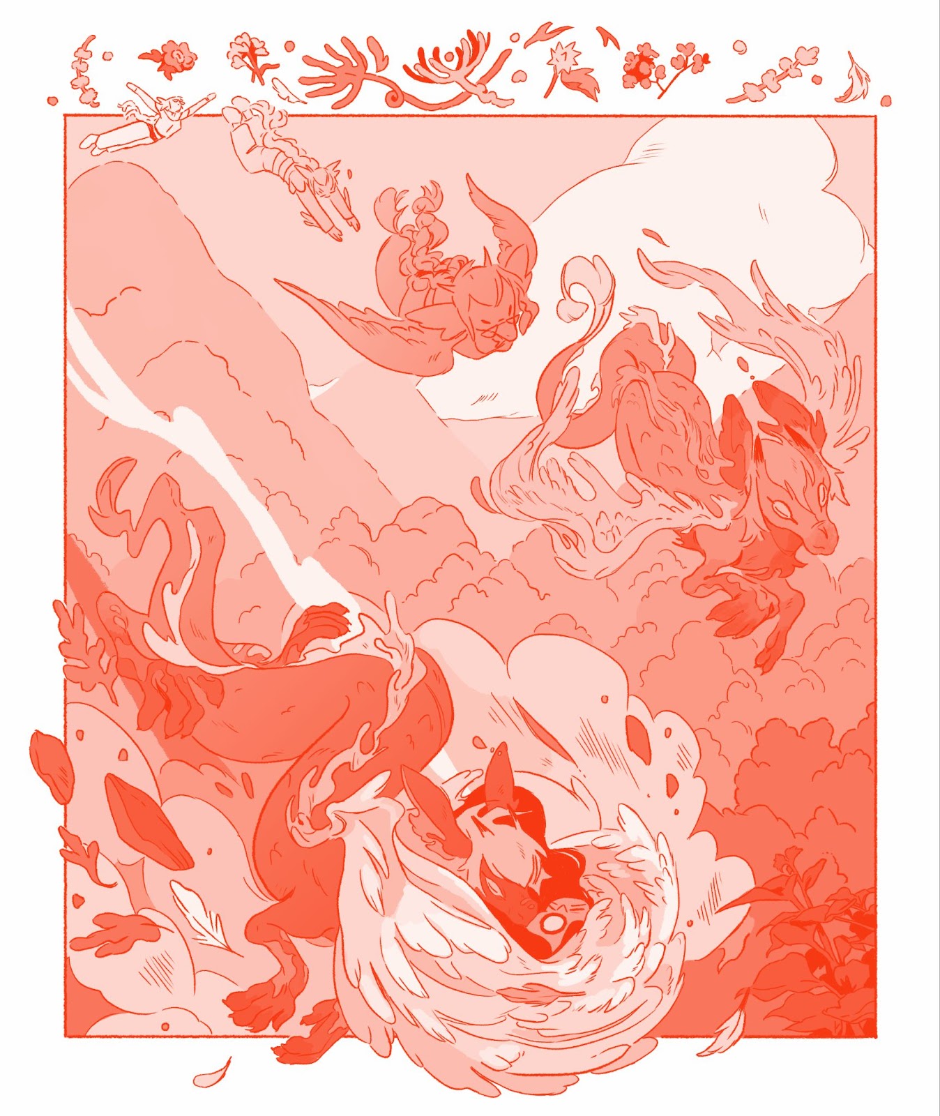
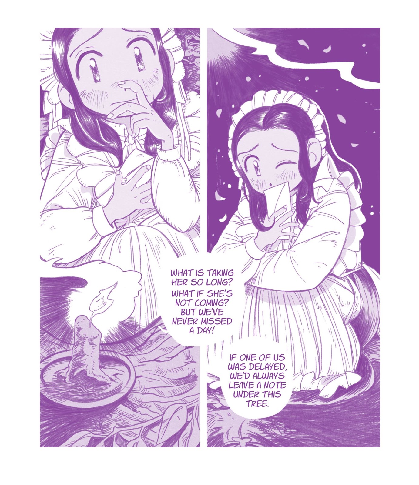
The cover of Issue One (by Steph Bulante, printed at Lucky Pocket Press) uses green and yellow ink, Issue Two (by Rosemary Valero-O’Connell, also printed at Lucky Pocket) uses green and red, and the color common to both is a bright, fluorescent pink: a color historically associated with femininity, girls, and love. The interiors are printed in a single color of riso ink, purple for the first issue and red for the second. The monochromatic printing and use of screentone effects does echo the black-and-white nature of serialized print manga, but the colors and shape make each issue feel more like a collectible art object, something to discover on a queer twenty-something’s rickety secondhand coffee table as a conversation piece.
The color choices also add to the mood of each story: the red stories in Issue Two feel vibrantly, loudly passionate, while the purple stories in issue one feel more serene, somber, and serious, even when they’re funny (like Mar Julia’s entry about the lifestyle youtuber). Issue Two additionally has full-bleed pages instead of the wide margins of Issue One, which make the comics feel more expansive and more like manga.
The possibilities of full bleed pages allow the contributors in Issue Two to experiment with more creative page compositions for extra emotional impact at key moments. In “My Type” by Lyle Lewis, Bea’s nature hike with a date is interrupted when they must dive off a cliff to save them. Lewis fills the margin with little leaves and flowers,a decorative element that adds to the sense of place and emphasizes Bea’s urgent movement as they knock all those leaves and rocks aside. But Issue One also has inventive panel arrangements and layouts contained within the strict safe areas. Pa-Luis combines borderless panels and word balloons with tall, vertical panels to create a sweet comic about maids in love that feels elegant and eternal.
In every comic featured across both issues, other manga-style creative choices affect the reading experience: sound effects, speech balloons and artwork spill over from panel to panel, directing the reader’s eye across the page and drawing attention to key elements. The depictions of emotion also take cues from manga aesthetics, with thin diagonal lines across a face indicating blushing and sweat drops down the side of a forehead showing embarrassment.
The shot choices especially recall emotionally-driven romance manga, with many comics using close-up shots of character’s eyes or hands to convey their feelings at important moments, or otherwise not showing the character’s face to let the reader fill in the expression on their own. Emma Jayne’s comic in the first issue ends with a panel of the protagonist, Monica, staring at the white monitors of her computer, her back to the reader as she cries and calls herself an idiot. In a more classic American-style romance comic, a scene like that would have ended with a shot of the character’s face. But aesthetically, Datura looks not to 1950s American romance comics, but to contemporary josei manga.
Datura is, to quote its own Carrd, a “josei-inspired anthology series featuring a range of speculative and realist stories for an queer adult audience that, like the poisonous datura flower, might have an edge to them.” Erica Sakurazawa has been publishing girl’s love (a manga genre focusing on relationships between women, usually romantic and/or sexual) about complicated queer women in josei magazines since the 90s; more recently, Takako Shimura’s Even Though We’re Adults, about a married woman having an affair with another woman she meets in a bar, was serialized in the josei magazine Kiss. But so many of the most popular GL manga, even those about adult women, follow similar formulas: two beautiful, feminine women, who work in an office together and slowly fall in love while engaging in delicately feminine pastimes like shopping and eating cake in an elegant, detached way. Butches are so rare in GL manga an entire anthology was created to celebrate butch/butch relationships, and speculative elements in josei GL are equally hard to find.
Datura approaches its inspiration from a different angle: identifying what’s left out of the GL zeitgeist and adding in Western indie comic influences to create stories that try to expand on the concept of girl’s love. There are virtual worlds and immortal vampires and winged demons and characters from all over the gender spectrum, and each story in each issue leaves a lasting impact in a short page count. The less speculative stories are very deliberately, intentionally grounded with specific details that anchor them in ways a lot of manga doesn’t. The characters in Mar Julia’s Issue One entry sweat and spill drinks and clutter the panels with objects. “Sitter,” by Remus Jackson, depicts characters with hairy bodies and top surgery scars. These comics are created for an audience of queer adults that will not only recognize the signifiers of queer culture on display, but participate in it themselves. This lets the creators leave a lot unstated, trusting the reader to connect the dots on their own. With its beautiful presentation and the thoughtful, creative storytelling on display, Datura innovates on the GL formulas while simultaneously showcasing some of the best work indie comics has to offer. I’m looking forward to the next issue.
Masha Zhdanova is a cartoonist, illustrator, writer and critic whose work has been featured on sites including Women Write About Comics and Publisher’s Weekly. To find more of her work, you can find her website here – or follow her on Twitter/X or Bluesky.


